

Before I get to the meat and potatoes of the blog, I want to put forth a disclaimer. The purpose of this blog is not to denigrate the hard work of teachers and support staff across the state of Louisiana. My intention is illustrate how a federally mandated system of accountability that allows all of the power to collect, analyze and disseminate data resulting from assessment to be held in the hands of one person is an invalid method of reporting the hard work and progress being made by the students in Louisiana.
Being a resident of Calcasieu parish, when last year’s school scores came out, I was very eager to study them. Calcasieu had the largest number of students to opt-out from the PARCC assessment. When the District Performance Score resulted in a drop from B to C, it was implied that it was caused by the large number of opt-outs. I wanted to see for myself. What I found was that Supt. White’s policy of nullifying the results of schools that had more than 10% of their students opt-out clearly showed that opt-outs were not the cause of the drop in the district score. The schools with more than 10% opt-outs received the same SPS score they received in the previous year. The benefit to Calcasieu was that nearly all of those schools were high performing schools. Graph A shows the findings.

In addition to the data illustrated above, I noted that the total number of SPS points from schools that declined out weighed the total points from schools that increased by 145.8 points. That translates to an overall large drop in total SPS points. For a year, I have maintained that the district’s drop in score was a direct result of the drop in scores among the failing schools. While this is clearly illustrated, the assumption is not entirely true.
Obviously, the release of the 2016 scores were highly anticipated. When the news came out that Calcasieu had brought its score back up to a B from a C, I wanted to see if I could determine how they did it. I started by comparing the 2016 results with the 2015 results and arranged them in order from the largest decrease to the largest increase. When I illustrated the data in a line graph, I was shocked by what I saw. See Graph B.
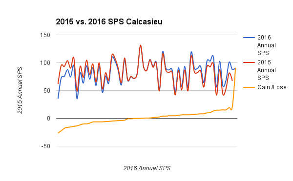
When you first look at this comparison between the two years, you immediately think, “Wow! They are nearly identical!” But when you take into consideration the yellow line that shows the greatest decrease to the greatest increase, you realize that it is statistically impossible for that to occur organically. If you would like to see all of the scores in Calcasieu, click here.
What really caught my attention here is that regardless of individual gains or losses, the shape of the line remains the same. In addition, the mean score, both years, is identical. Simply put, the relative placement of individual schools is the same in both years.
After that, I wanted to compare the 2015 and 2016 scores of all of the districts in the state to see how it compared to the shape of Calcasieu’s scores. See Graph C.

If you would like to see the statewide results, click here. The most important thing to understand from the above graph is that each individual school represented in the graph is positioned between the same two schools in both years. What does that mean and what does it tell us? First, it clearly means that the data has been manipulated to a predetermined end. Second, it does not accurately show gains or losses throughout the distribution; but instead, it indicates our schools and districts are chugging along at consistent levels and not making significant gains, or losses. How are differences in scores even possible?
During the transition years from Grade Level Expectations to Common Core State Standards, and the transition from LEAP to PARCC, BESE decreed that no schools would suffer penalties during transition and that each year, the school scores would match the distribution of the 2012-2013 school year. The terms of that reprieve over multiple years is what allows Supt. John White even more control over the end reporting of the scores.
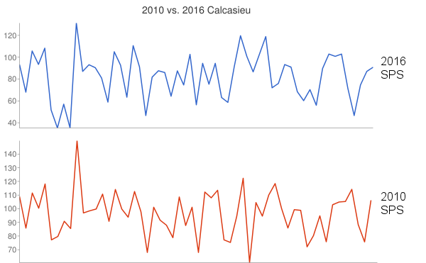
It is a very complicated statistical process, but in layman’s terms, the raw scores are converted to Z-scores with a mean of zero and a standard deviation of 1. The two sets of scores are then slid over to align the zero, or mean. Once aligned, the scores are converted to scaled scores which are the scores that we see. If the distribution isn’t where it needs to be, the cut score is adjusted and the process starts over. The process of determining the cut score, aligning the distribution and converting to scaled scores maintains similar patterns in the middle of the distribution, but the decreases and increases on the far left and right are exaggerated, and may not actually reflect real gain, or loss. To better understand this, see Graph D, below.
So what does this tell us? It tells us that schools consistently perform relative to the schools around them. Simply put…high performing schools continue to perform high and low performing schools continue to perform low. I now believe that the drop in score that Calcasieu received was merely a result of data manipulation. It seems cruel, but it is necessary to understand this to understand why the accountability system is invalid.
The question, now, is if schools perform consistently regardless of the instrument used to measure them, what accounts for the differences in scores from year to year? It is the process of converting scores and aligning the mean scores that creates exaggerated gains on the right and exaggerated losses on the left. Keep in mind, these are meaningless numbers and do not accurately reflect the performance of the schools. If the measurement were accurate, and the reform processes that we have experienced over the years, were actually working, the peaks and valleys would get smaller over the years with the goal of a straight line that steadily rises. Clearly, that is not happening.
Over the years, a lot of changes in the name of reform have been made in our schools. Each of these changes serve as variables that ultimately manifest themselves in the form of school scores. A valid question to ask is how do relative school score remain consistent in spite of so many variables? Lets look at the variables that have been introduced in the name of reform.
- Standards: From 2010 to 2016, Louisiana has had three sets of academic standards. Technically, only two, but the reformers insist that we no longer have Common Core State Standards.
- Assessments: We have had three different assessments during this time period. LEAP, PARCC and LEAP21. Again, technically only two because PARCC and LEAP21 are essentially the same.
- Teachers: Even without the implemented changes, you would be hard pressed to find a school that hasn’t had at least a 50% change in faculty over a six year period. Add to that the changes in evaluations and the frustrations from standards and assessments, and you’ll find an extremely high turnover rate during this time period.
If you have ever done any type of experimenting then you know that when you change a variable, and the outcome remains the same, it is safe to assume that the variable is not a significant contributor to the outcome. When a variable is changed in tandem with multiple variables and still no change, then you can assume that a constant exists that contributes almost entirely to the outcome. What is the constant?
It is a fact that schools are immovable property, and the condition of schools can vary dramatically depending on where they are located. It would be wrong to assume that the condition of a school building is a major contributor to changes in scores. I say this to make a point. Schools are located in zones. What do schools draw from that zone?
- Finances: While it is true that state dollars are distributed evenly throughout a school district, schools draw their additional finances from the zone they are located in. In the strictest sense, schools in financially challenged zones have fewer resources; however, federal dollars are intended to offset that by targeting these schools.
- Students: One could argue that students aren’t constant because they change each year, but that isn’t the constant. Students are the product of the constant, and that is the zone in which they live.
One of the major tenets of the education reform is “every child deserves a quality education regardless of their zip code.” I do not disagree with that. What I do disagree with is the idea that changing standards, assessments or teachers will improve the quality of an education in a specific zip code. Millions and millions of dollars have been wasted on these changes that have had zero significant effect when that same money could have been used to remove the barriers to learning that exist in impoverished schools.
